A B2C mobile app designed to connect people through music.

VIB is a music discovery app focused on creating an engaging platform for music lovers. Their mission is to help users easily find and share music, fostering a community-driven experience. At VIB I was entrusted to design key app screens to enhance user engagement and streamline the process of music discovery and sharing, addressing their need for a more intuitive and appealing user interface.
My Role
UX/UI Designer
Tools
Figma, Loom, Slack, Monday.com
Process
Discover, Sprint 1, Sprint 2, Delivery, Reflection
VIB faced the challenge of bringing its concept to life by designing new app screens that aligned with its brand vision. The core issue was balancing the introduction of new features with maintaining user familiarity, ensuring these updates felt intuitive within the existing structure. Additionally, it was crucial to maintain consistency across the app by updating the style guide and ensuring all designs adhered to VIB's branding.
Our team successfully designed and delivered over six key workflows that improved the overall user experience of the VIB app. Specifically, I led the design of the "Daily Song" and "Song Sharing" pages, focusing on creating engaging and intuitive interactions that encouraged users to discover and share music easily. I was deeply involved in developing the trending and daily song-sharing workflows, ensuring these screens stood out with visually appealing and functional designs that aligned with user needs.
Collectively, our team also redesigned critical pages such as onboarding, user blocking, and the overall song-sharing experience. We prototyped each feature, incorporating feedback at each stage to refine our designs. Through a thorough process of competitive analysis, design iterations, and rigorous QA testing, we ensured that each screen not only met but exceeded the expectations set by VIB. The strategic improvements we implemented were key to the VIB founder's satisfaction, culminating in a successful sign-off on the project.


The VIB project began with a clear objective: to redesign key aspects of their music discovery app into a working prototype. Our team of five was tasked with redesigning the screens for six core workflows, focusing on refining the app’s look and feel while maintaining consistency with VIB’s branding. The client provided us with essential materials, including initial wireframes, app screenshots, sketches, and the VIB 01 design file, which served as our foundation. Leveraging these resources, I took the lead in reviewing and updating the existing style guide to ensure alignment across the new designs and create a cohesive design system that met the client’s expectations.
We structured the VIB project into two sprints, each involving the Research, Ideation, Design, and Iteration phases. My focus was on enhancing the song-sharing screen and the daily song chart/explore page, and I collaborated with my team to develop the final prototype by the end of sprint two.
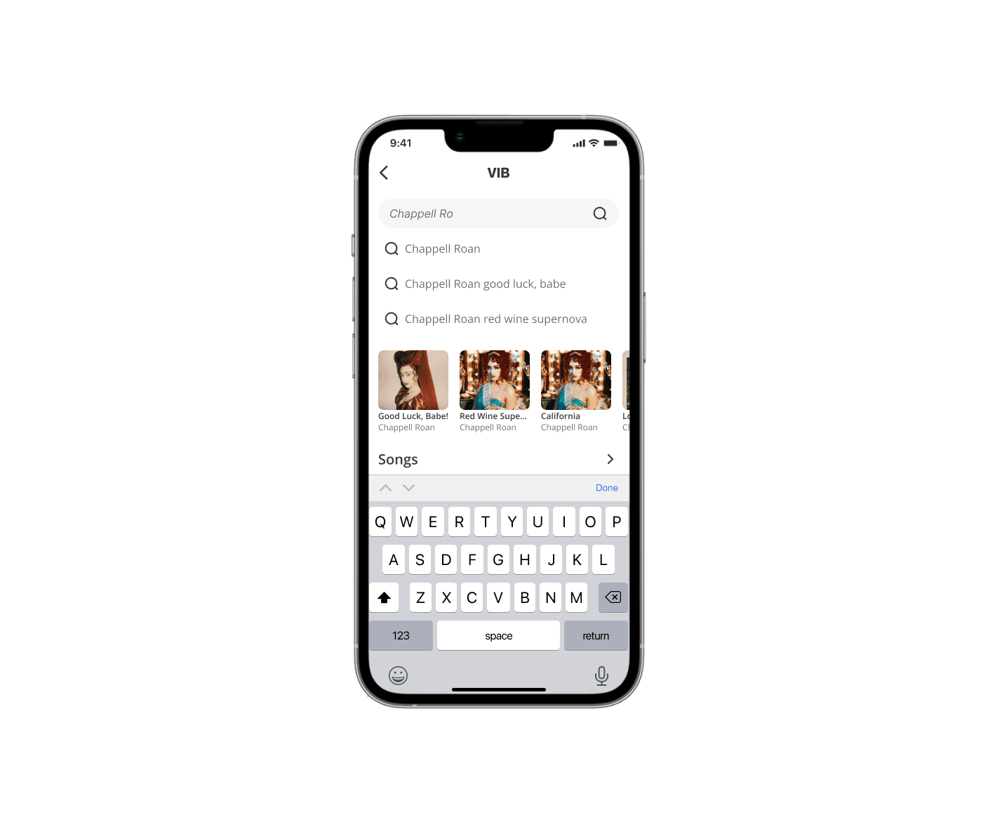
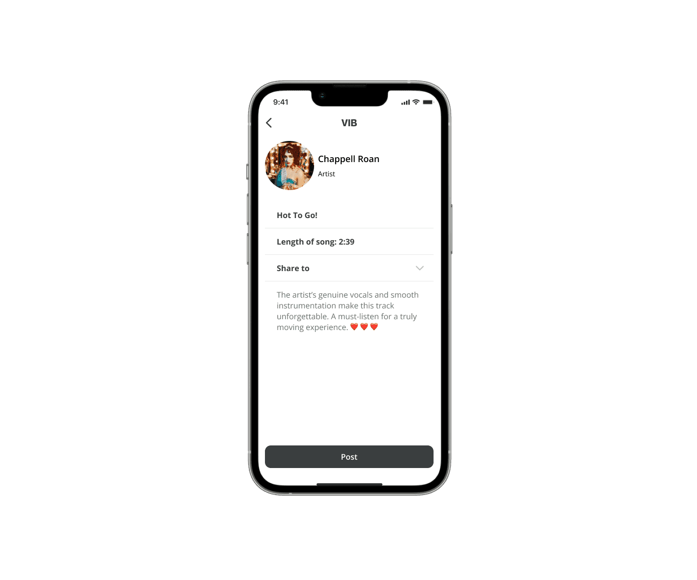
Sprint 1 - Share Screen
Sprint 2 - The Daily Song Chart/Explore page Redesign
Research
For the redesign of VIB's app, we conducted research focusing on industry standards and user experience benchmarks by examining competitors, including social media platforms like Instagram and TikTok, as well as music apps like Apple Music and YouTube Music, since the application blends both music and social media features. These platforms were chosen for their effective integration of social features and user engagement strategies.
Competitor Analysis: We analyzed these platforms to understand common design elements and how they maintain consistency. Key observations included their layouts for posts, landing pages, and consistent use of design elements. Instagram and TikTok were particularly useful in revealing effective practices for navigation placement and text hierarchy.
Key Takeaways:
Common Layouts
We noted the common elements in social media posts and landing pages, which helped us understand effective layout structures.
Consistency
The consistent use of design elements across Instagram and TikTok highlighted the importance of uniform navigation placement and text hierarchy.
Navigation
The placement of navigation elements, such as bottom navigation bars, was crucial for user accessibility and ease of use. By incorporating these insights, we were able to design new screens for VIB that align with industry standards, ensuring an intuitive and engaging user experience while maintaining consistency with established design practices.

Ideation
During the ideation phase, I created the initial drafts for the share screen, drawing on insights from our research and competitive analysis. I compared various music and social media apps, taking screenshots to identify key elements that resonated with users. One challenge I faced was deciding which features to incorporate, given the differing standards between the two industries. Social media platforms like Instagram and TikTok influenced my decision to place buttons prominently, as these apps excel in making calls to action clear. On the other hand, I drew inspiration from Apple Music and Spotify for their sleek slider designs, as they had established a consistent music interface that users found familiar. By blending these core elements, Instagram’s sharing layout with Apple Music’s interface, I aimed to create a hybrid design that combined the best of both worlds. This approach ensured that our final design adhered to industry standards.

Iteration
Our design process involved several key iterations, shaped by feedback and challenges encountered along the way. Initially, we built upon client sketches and industry research but faced obstacles such as text hierarchy, the integration of new icons, and ensuring compatibility with Apple Music. Feedback and
Adjustments: Text Hierarchy: One of the first pieces of feedback we received was the need to clearly define the text hierarchy on the share screen. Originally, the song title, album, and artist information were all clustered together, which compromised readability. To address this, we refined the text sizes and spacing, prioritizing the song title with the largest text, followed by the artist’s name. The album title was moved to a different section at the top of the page to reduce clutter and improve user experience.
Compatibility: We also ensured that the design aligned with Apple Music's integration requirements. A key compliance issue was ensuring that each song featured a "Listen on Apple Music" button, a necessary feature for Apple’s partners. This was seamlessly incorporated into the design without overcrowding the screen.
Through these iterations and feedback, we streamlined the user interface, removing unnecessary clutter, and ensuring that the app met both usability standards and Apple Music's compliance requirements.

For Sprint 2, I was tasked with redesigning the Daily Song Chart/Explore (For You) page for the application.

Ideation
During the ideation phase, I leveraged insights from my research, focusing on the consistent use of block sections, which were prominent in competitor apps and our previous designs. Since the app already utilized block structures in another music-related section, I built upon this familiar framework to maintain consistency and cohesiveness across the application.
To enhance the user experience for the "Daily Song Chart/Explore" page, I introduced new features tailored to music discovery, including advanced search functionalities, suggested filters, and tools for saving and sharing content. These additions were informed by user expectations and project goals, ensuring that the design was both intuitive and innovative. The layout prioritized ease of navigation while providing users with enhanced discovery options. By blending familiarity with new elements, I ensured that the page remained visually appealing, functional, and aligned with user needs.
This ideation phase was pivotal in setting the tone for the rest of the design process, ensuring that the new features integrated smoothly with the app's existing interface while delivering added value to users

Iteration
Throughout the design process for the "Discover" page, feedback from the senior designer played a crucial role in refining key elements. After two rounds of feedback, I addressed several challenges related to spacing, alignment, and visual hierarchy, resulting in a more polished and cohesive design.
One major challenge was avoiding the creation of multiple block styles to display music. Initially, we were on track to introduce three distinct styles, which would have added unnecessary complexity. By revisiting this approach, we were able to streamline the design by revising one block style that could be adapted across multiple screens, maintaining consistency. We created a flexible component with variants to handle different states within the same block, enhancing the uniformity of the app's visual language.
Another area of focus was the filter buttons. At first, the app used two different sets of filter toggle buttons across various screens, creating a disjointed user experience. After discussions with the team, we agreed to unify the filter design to one consistent look and feel, ensuring that all filters aligned with the new design standards. This helped improve both the aesthetic cohesion of the app and its functionality.
These iterations were essential in refining the "Discover" page, ensuring it not only met the project’s visual goals but also provided a consistent user experience across the app.

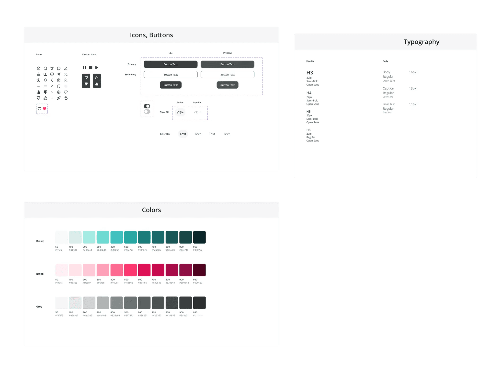
The design system enabled the team to maintain a consistent and intuitive user experience across the VIB app. While the initial design system was already established, our team focused on enhancing and expanding it by adding new elements, such as play and stop buttons, that were essential for the app’s functionality. We selected icons that matched the existing style, ensuring they were seamlessly integrated with the app’s overall look and feel.
The neutral color palette was chosen to maintain a clean and adaptable interface, allowing the vibrant album and song artwork to stand out without clashing with the app’s design. This approach aimed to keep the interface agile, supporting various music genres and visual elements without overpowering the user’s experience. The font selection was consistent with the original branding, providing clear readability and maintaining the established hierarchy across screens.
Developing the VIB prototype was a crucial step in bringing the redesigned app to life, showcasing the complete user journey from start to finish. The prototype featured over 50 interconnected screens, each representing key workflows such as song sharing, daily song charts, and user onboarding. My primary focus was on ensuring seamless navigation between screens, aligning with VIB’s design standards, and capturing the core features that enhanced the music discovery experience.

Reflecting on the VIB project, my primary focus was enhancing the share screen and daily song chart sections, where I honed my skills in prototyping, iteration, and strategic design thinking. I enjoyed working on these elements because they were crucial touchpoints that directly impacted user engagement within the app. My design decisions, like integrating familiar sharing layouts from social media and the sleek music interface style from Apple Music, were aimed at creating a seamless and intuitive experience that would keep users engaged and encourage them to explore and share more music within the platform. These choices were made with the app’s goals in mind: driving user retention and enhancing the overall discovery process.
One of my key takeaways was the importance of balancing consistency with creativity. Maintaining visual coherence across the different app features while integrating new elements required a keen eye for detail and adaptability. For instance, ensuring the alignment of icons and buttons across screens wasn’t just about aesthetics; it was about crafting a fluid user experience that felt intentional and effortless.
Working with the other designers, I had to ensure that our prototypes were not only functional but also aligned with the overall vision of the app. I contributed to the prototyping process by documenting every decision, allowing any team member to understand the flow at a glance. I found that strong, structured communication was essential for maintaining the project's direction, especially when integrating feedback from stakeholders.
If given more time and resources, I would have further refined the design system to incorporate more dynamic components that could be tailored to individual user behaviors, enhancing personalization and interactivity. Additionally, I would explore deeper user testing to validate how well the new features resonate with different user groups, allowing us to make more data-driven adjustments. This project reinforced the importance of being adaptable, detail-oriented, and user-focused, which I will carry forward into future design endeavors.